The short version

Ten problems from three companies, a paragraph each

Financial services

PagAmerican

Four questions a balance has to answer.

Problem

On a platform that holds other people’s money, the balance is the most emotional screen in the product. A number with no explanation behind it is not information, it’s a reason to open a support ticket.

Solution

I designed the financial experience end to end: separate balances instead of one aggregate number, a release schedule you can navigate down to the order that generated each amount, per-order deductions shown where the value was created, and a movement history where every entry links back to its origin. Semantic colour carries meaning throughout — a pass-through is not a loss, and the interface never pretends otherwise.
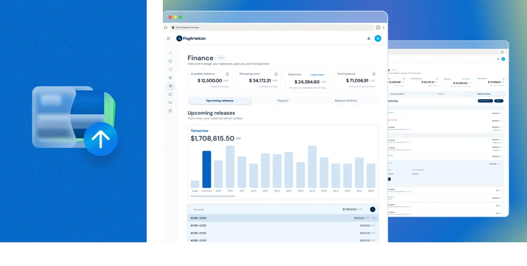
The balance broken into separate figures, with a release schedule that traces each amount back to the order that produced it.

Design System

PagAmerican

One designer, three developers, six months.

Problem

One designer, three developers, six months of runway. Building a component library the traditional way would have consumed the runway before the platform had users.

Solution

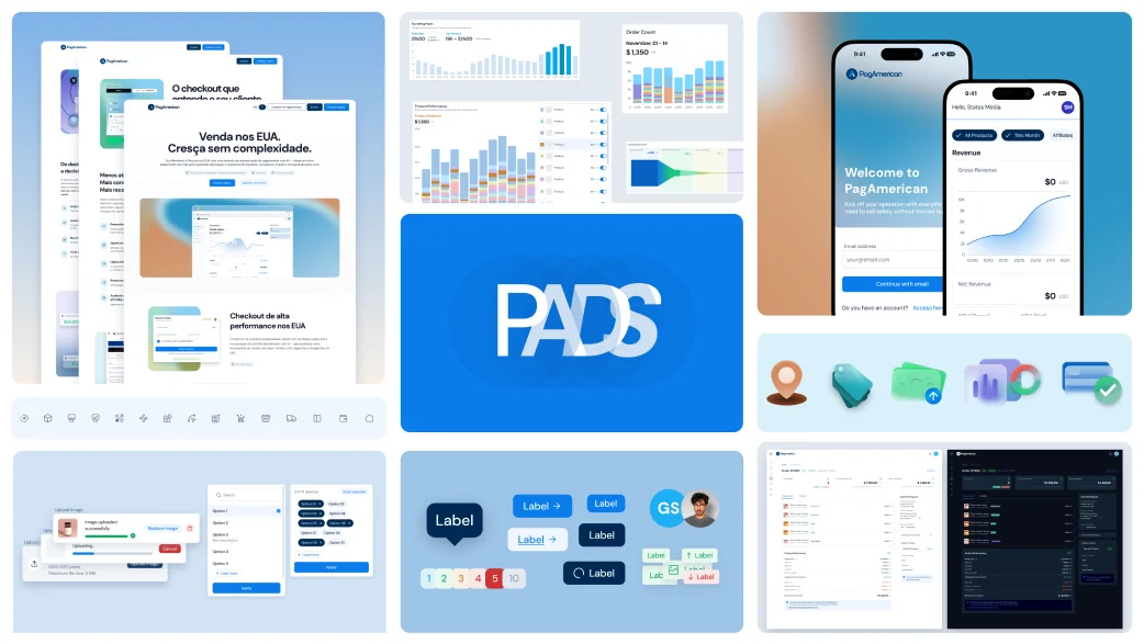
I built PADS as a pipeline rather than a library. A Figma frame goes in; the step that decides reuse happens before any code is generated; a registered component comes out. Verification blocks: four automated eval suites, a design review, a code review, and a contrast check in CI. Nothing ships that fails. The result is 39 components and 240 tokens across three layers, light and dark from day one, zero hardcoded colors — 41 pull requests in about five weeks, at US$6.23 per component. The system wasn’t the deliverable. It was what made every following decision cheaper than the last.

The PADS pipeline: a Figma frame entering, the reuse decision, and the registered component that comes out the other side.

Checkout

PagAmerican

The last screen before the money moves.

Problem

The checkout is where every decision in the platform converges: payment method, tax, coupon, order bump, risk. It is also the only screen where a mistake costs money on the same day.

Solution

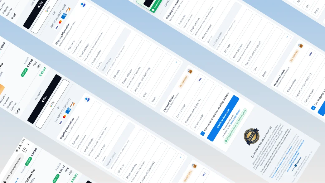
I designed the whole thing: single page, mobile-first, running on the merchant’s own domain. Wallets come first: if you have Apple Pay or Google Pay, you never see a card form. Sales tax is shown, not absorbed. And a declined payment used to be a dead end, so I went through Airwallex’s documentation, mapped 154 issuer and network response codes into 23 real situations, and built a recovery path for each one. That part is there for a specific reason: approval rate and conversion are the two numbers this screen gets judged by.

The single-page checkout on a merchant domain, wallet options ahead of the card form and sales tax shown as a line of its own.

Spending tracking

Mercado Livre

Engagement from something already built.

Problem

Our users struggle to manage their finances. They feel a lack of control when it comes to organizing their money and understanding how they spend it.

Solution

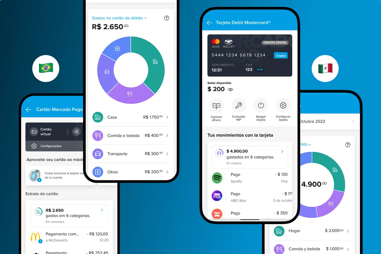
By providing a visualization of how they have spent their money with debit card, people will be able to use us more, increasing both payment transactions and interactions on our dashboard.

Mercado Pago spending screen listing debit card purchases grouped by category. Monthly spending summary with a category breakdown and comparison against the previous month.

PIN change

Mercado Livre

Changed in the app. Never confirmed.

Problem

In Mexico, upon receiving their debit card, users are assigned a PIN by Mercado Pago. While they can change this PIN, the new one must be validated offline by confirming it at an ATM. Currently, many users change their PIN in the app but fail to validate it at an ATM—leading to failed transactions when they attempt to make purchases.

Solution

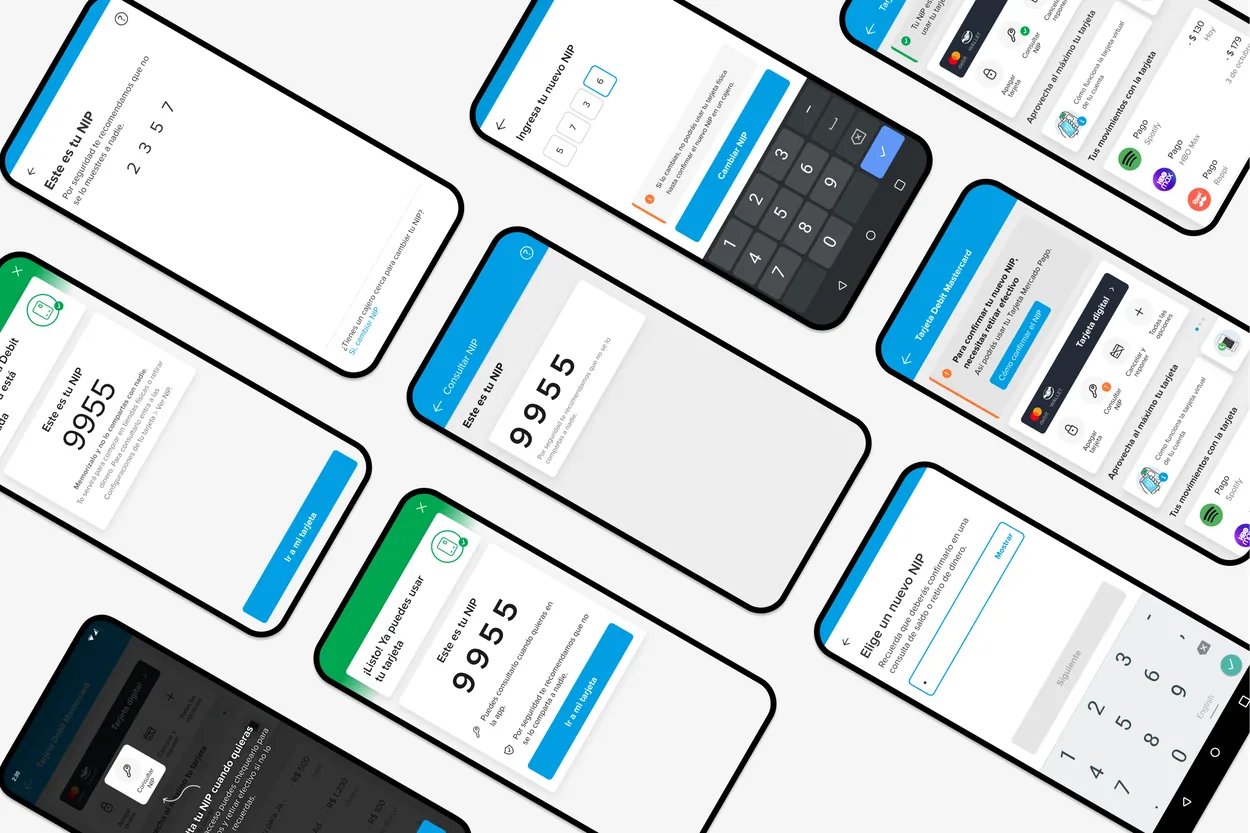
To prevent this issue, we ensure users are aware from the moment of card linking that they already have a pre-assigned PIN, which they can view and memorize. Additionally, we enhanced the PIN change flow to guide users more effectively and introduced status indicators showing when the card is ready for payments.

Card screen revealing the pre-assigned PIN so the user can read and memorise it. PIN change flow with a status indicator confirming the card is ready for payments.

Card settings

Mercado Livre

Blocking a card meant phoning a human.

Problem

Our contact rate is too high due to users struggling to find basic card settings, such as Blocking, Viewing PIN, Canceling, and Requesting a Replacement.

Solution

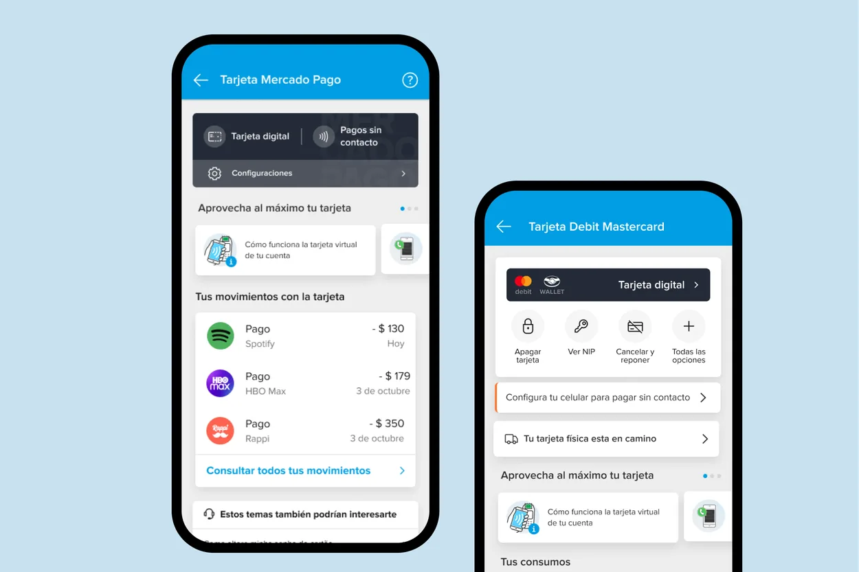
We introduced shortcuts to these settings directly on the card screen, making them easier to access and reducing unnecessary support requests.

Card screen with shortcut buttons for block, view PIN, cancel and replace. Expanded card settings reached in one tap from the shortcut row.

In-app messaging

Hotmart

Every team improvising its own channel.

Problem

The teams solve their communication/support needs on the Platform (and beyond) without standardization, which can lead to user confusion, delay, lack of response, low engagement and even churn.

Solution

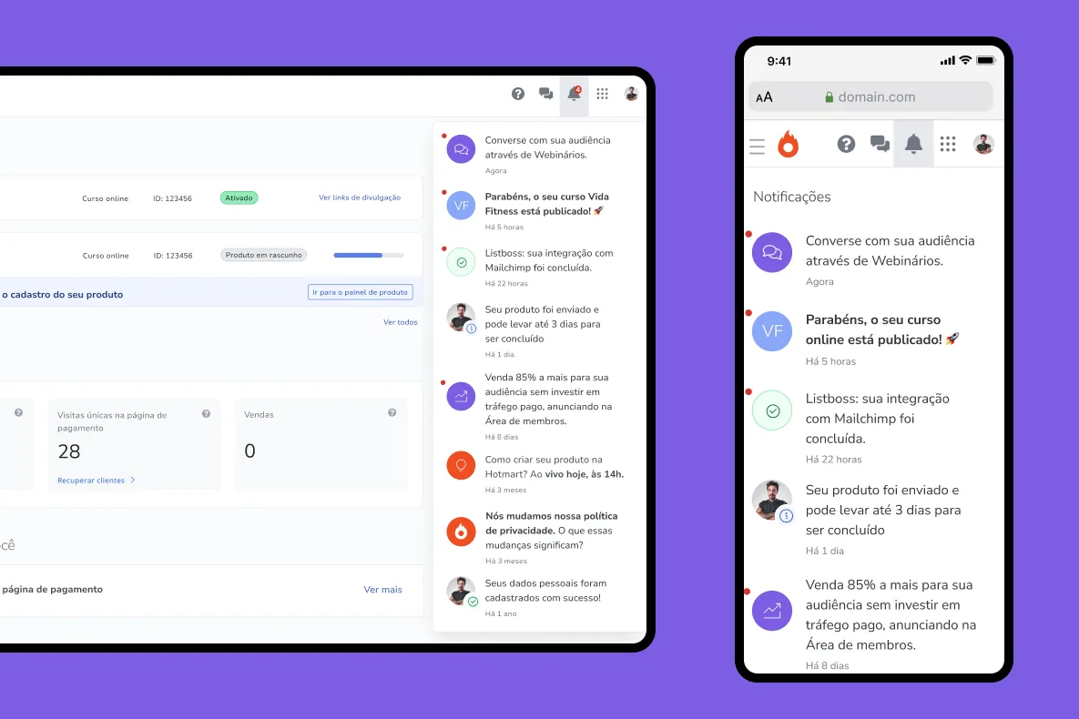
The notification bell revolutionizes in-app communication by delivering messages directly to users while they navigate the app—whether on desktop or mobile. These messages are triggered in real time based on specific user actions, ensuring a personalized and relevant experience.

Hotmart notification bell open, showing messages triggered by the user’s recent actions. The same notification centre on desktop, anchored to the platform header.

Onboarding & qualification

Hotmart

Not everyone arrives for the same reason.

Problem

We do not identify and qualify all possible profiles that the digital market contemplates today. We have a high drop-off in our funnel. More than half of the people who have their product ready do not persist. It’s difficult to develop in the digital market as a whole.

Solution

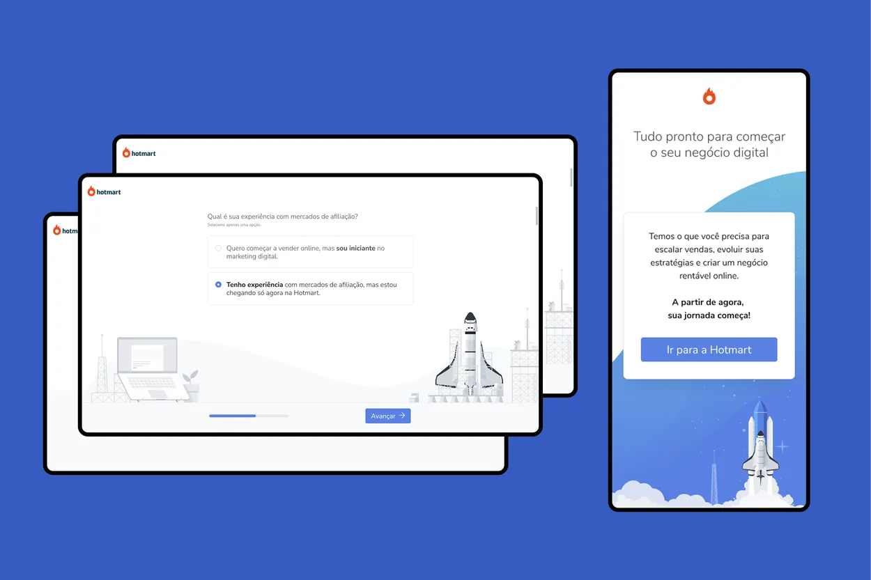
Implement a new onboarding process that generates information to create experience contexts/setup for the different user profiles on Hotmart.

Onboarding question that sorts a new user into a profile before the platform is configured. The tailored starting context each profile lands in after onboarding.

Guided first steps

Hotmart

Fifty tools, and no obvious place to start.

Problem

Hotmart offers a vast ecosystem of over 50 tools, but many users struggle to navigate them, unsure where to begin. A critical gap exists between “the knowledge I want to sell” and “the tools I need to bring my business to life—creating, promoting, and selling.” This confusion leads to friction, hesitation, and missed opportunities.

Solution

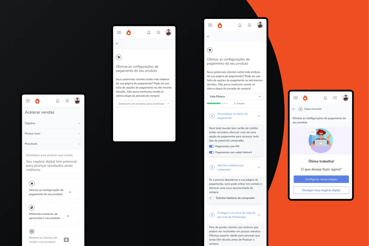
To bridge this gap, Hotmart developed Creator Goals, a simplified and structured approach that guides users on the essential actions to take after their first sale. By streamlining product steps—previously scattered across different areas of the platform—Creator Goals reduces friction, enhances clarity, and empowers users to confidently leverage the tools available for their business growth.

Creator Goals checklist showing the next essential action after a first sale. Goal steps gathered into one place, previously scattered across the platform.

Signup

Hotmart

Signup as a source of signal, not a form.

Problem

Around 60% of users abandon the signup screen, impacting conversion rates. Refining this experience can improve successful registrations.

Solution

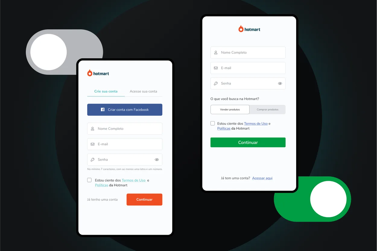
By streamlining the signup screen and removing unnecessary components, we simplified the process and successfully increased the signup conversion rate by 3.13%.

The streamlined Hotmart signup screen after unnecessary fields were removed.