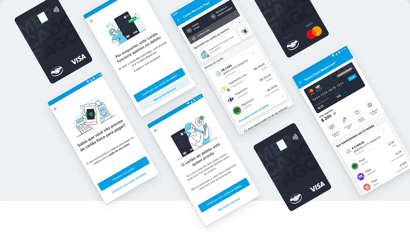
Context & problem
Mercado Pago’s card is prepaid and behaves like debit: it spends the money already in the account and never lends. It exists in four countries, and in its first three months it was losing the people who had just asked for it. Retention sat below 50% in Brazil and Mexico — in Brazil it fell to roughly 30% by month eight. Churn peaked between month zero and month one at around 30%. And reactivation collapsed as time passed: 27% after thirty days, 11% after sixty, 6% after ninety.
That last number is what set the strategy. After ninety days, a customer isn’t dormant — they’re gone. So whatever we did had to land inside M0 to M3.
A workshop with the squad turned that window into two opportunities, and each became an initiative: make people understand what they were getting before it arrived, and give them a reason to open the app once it had.
My role
Senior UX Designer on the Mercado Pago card squad, working across Brazil, Mexico, Argentina and Chile with a team spread across six countries. I facilitated the workshop that framed the two opportunities, ran desk research, evaluated the trade-offs, and adapted the second initiative for Brazil and Mexico. On spending tracking I held most of the ownership, since the need for a UX writer there was minimal.
The primary research — 68 interviews and a survey with more than 4,500 responses — was conducted by the User Research team. My work was turning it into a product decision.
Initiatives
- Intelligent Issuance
- Spending tracking
What we move
- M0–M3 retention
- Card issuance cost
- Transactions per user (TPN)
- Contact rate
Two initiatives, one window. The first repairs what happens before the card arrives — the expectation people carry into it. The second repairs what happens after — whether they ever find the thing that would bring them back. Neither works alone: telling someone their card is debit-only keeps them from being disappointed, but it doesn’t give them a reason to return.
Break point 01
Intelligent Issuance
Enhance awareness of the debit functionality available, while focusing on reducing issuance costs
Context & problem
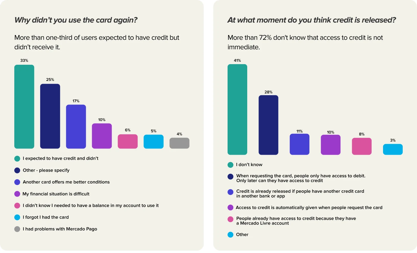
The card is prepaid and works like debit. People asked for it expecting credit. That single misunderstanding was doing measurable damage: 33% of the people who stopped using the card stopped because they had expected credit and didn’t get it, and more than 72% didn’t know that credit access wasn’t immediate. Meanwhile, users who did have credit transacted 4.5x more than debit-only users — so the appetite was real. Only the timing was wrong.
And every disappointed person had already cost the company a manufactured, shipped card. In Mexico, 59% of delivered physical cards were never used at all.
Key insight
The gap wasn’t in the product. It was in the request. By the time someone held the card, the wrong expectation had been formed weeks earlier, in a flow that never told them what they were getting. So the intervention had to move upstream — into the moment of asking, not the moment of using.
Details
More than one-third of users expected to have credit but didn’t receive it.
How could we maximize the activation rate of cards relative to the issuance rate?
Hypothesis
Expectation over persuasion: If people learn the card is debit-only before it is manufactured, the disappointment that drives a third of the churn never forms.
Segment before you speak: Someone likely to use debit well and someone likely to be disappointed need different messages at the same moment, so propensity should decide the copy rather than the funnel stage.
Digital before plastic: If people understand they can already pay without the physical card, a share of them will stop requesting one they don’t need.
Cost at the source: If a minimum balance is required to request a physical card, the cards that would never be activated are the ones that never get printed.
Value props
In the physical card request flow, we implemented the following additional steps:
The card works exclusively as a debit card;
You don’t need a physical card to make payments;
You must have an account balance to use the debit card.
A third didn’t come back because they expected credit. Seven in ten didn’t know credit wasn’t immediate.
Solution
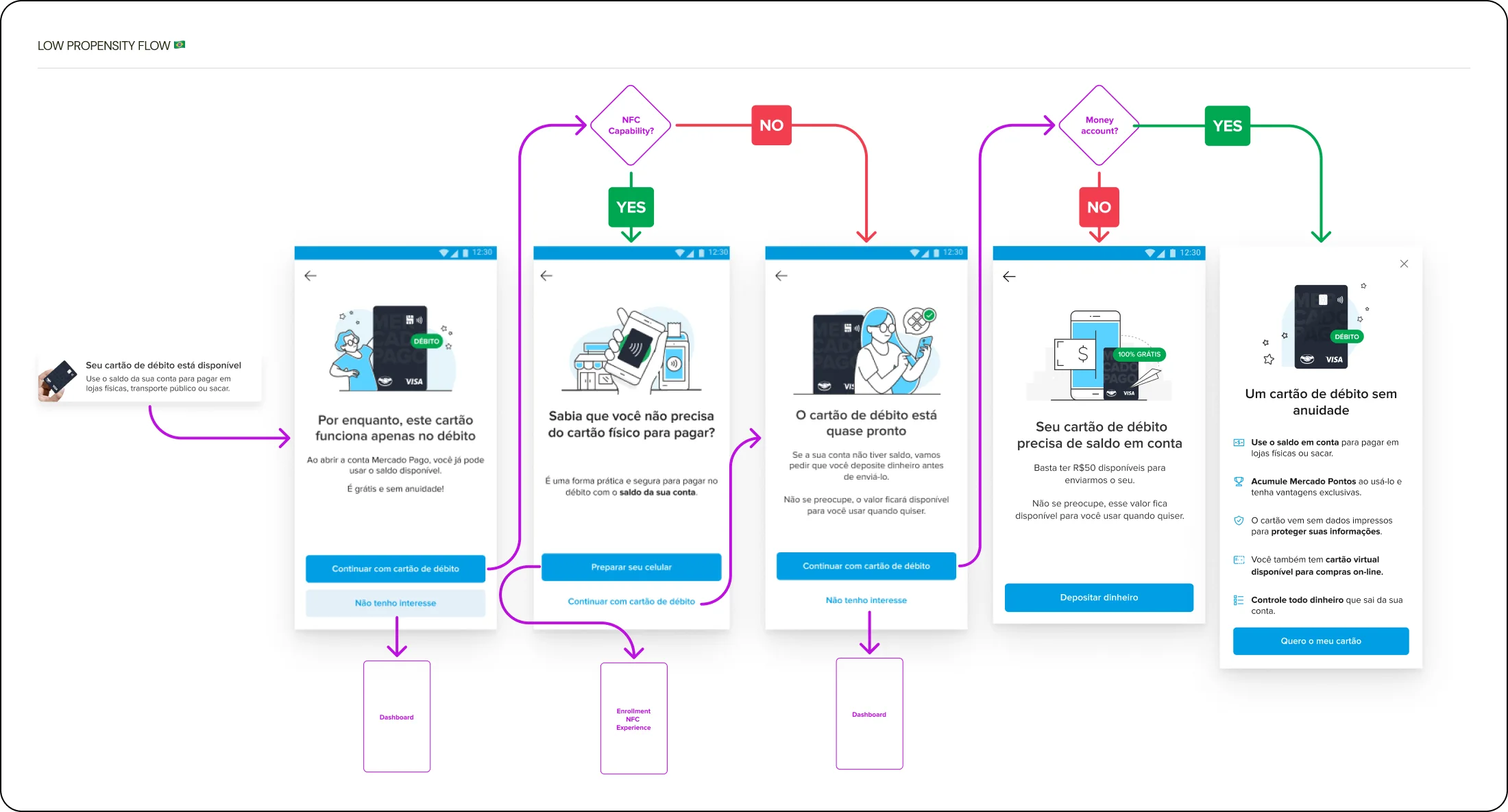
We segmented the request flow by propensity. Someone likely to use debit well and someone likely to be disappointed no longer see the same screen: the message adapts to who is asking, and both learn what the card actually does before it is manufactured. Three additional steps entered the flow — the card works exclusively as debit, a physical card isn’t necessary to pay, and an account balance is required to use it.
In Mexico we went further and tested different minimum balances to request a physical card, varying by propensity: $700 for low, $300 for mid, $0 for high. The cheapest unused card is the one that never gets printed.
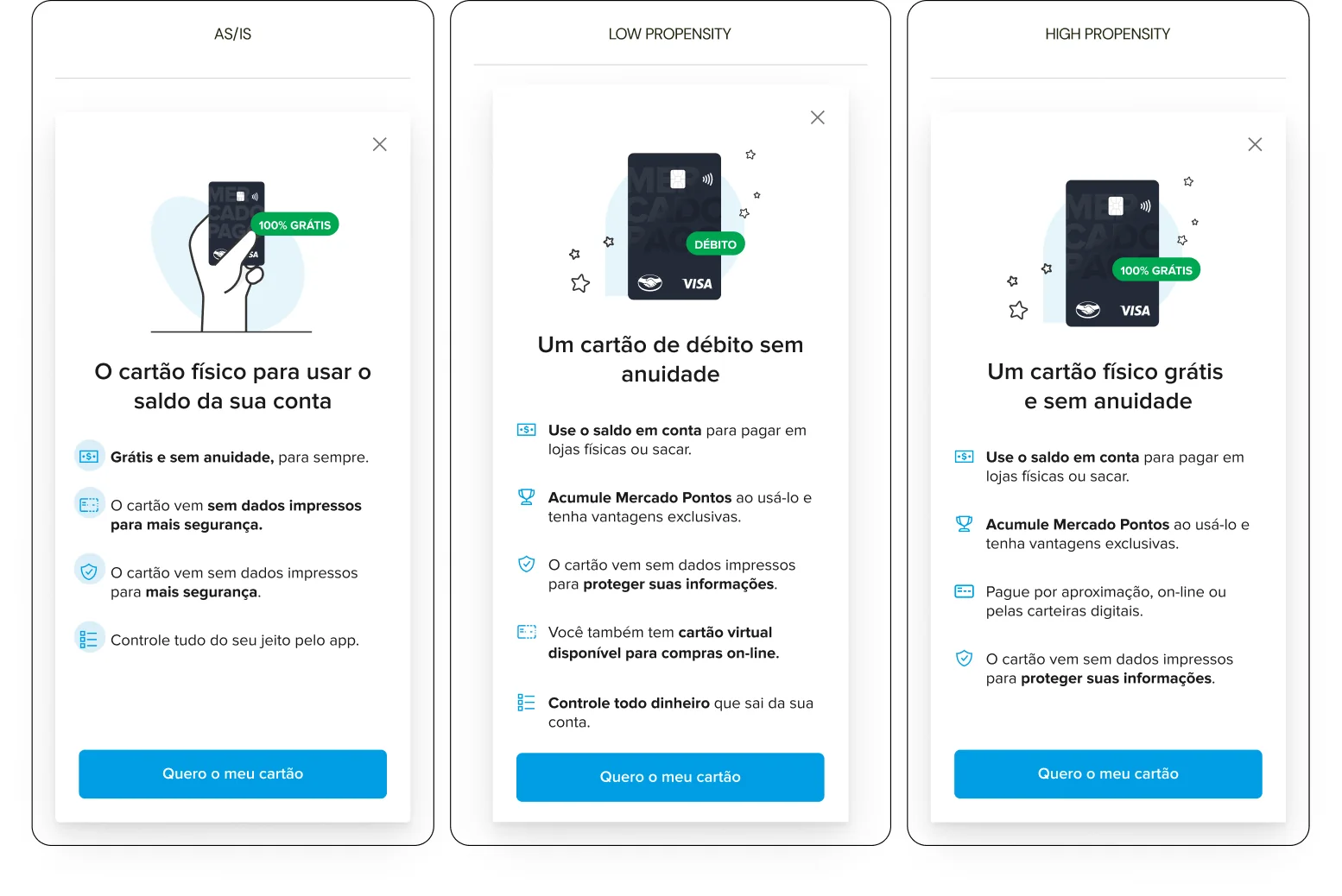
Low propensity flow — Brazil
Impact
Brazil: issuance of physical cards for low-propensity users fell by up to 60% in the first month.
Mexico: issuance fell 37% for mid-propensity and 49% for low-propensity users, with activation rates rising roughly 0.72%.
Retention across the same period rose from 55% to 57%, though three other efforts were running alongside — the honest claim there is contribution, not cause. The issuance numbers are the ones that belong to this work.
Break point 02
Spending tracking
Add real value to our debit users’ experience with a tool that generates more recurring actions on their dashboard.
Context & problem
People couldn’t answer a simple question about their own account: where did my money go this month? An internal study — 68 interviews and over 4,500 survey responses — put numbers on it, and the market context agreed: the average person in Brazil went from 2.1 accounts across different banks in 2015 to 5.5 in 2023. Money got scattered, and nobody was holding the thread.
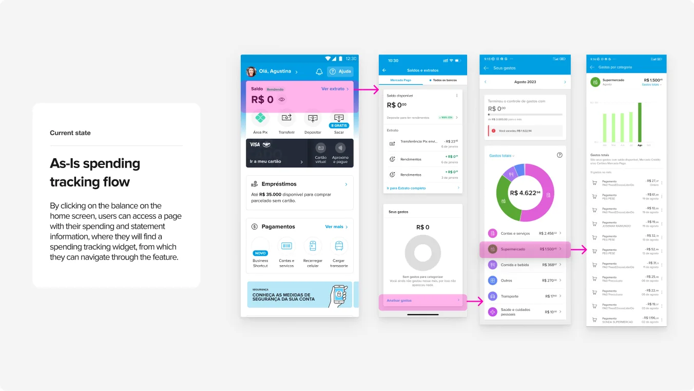
Here’s the part that makes this interesting: the answer already existed. A spending tracking screen was live in the app, reachable by tapping the balance on the home screen. Almost nobody got there. The feature wasn’t missing — the door was.
Key insight
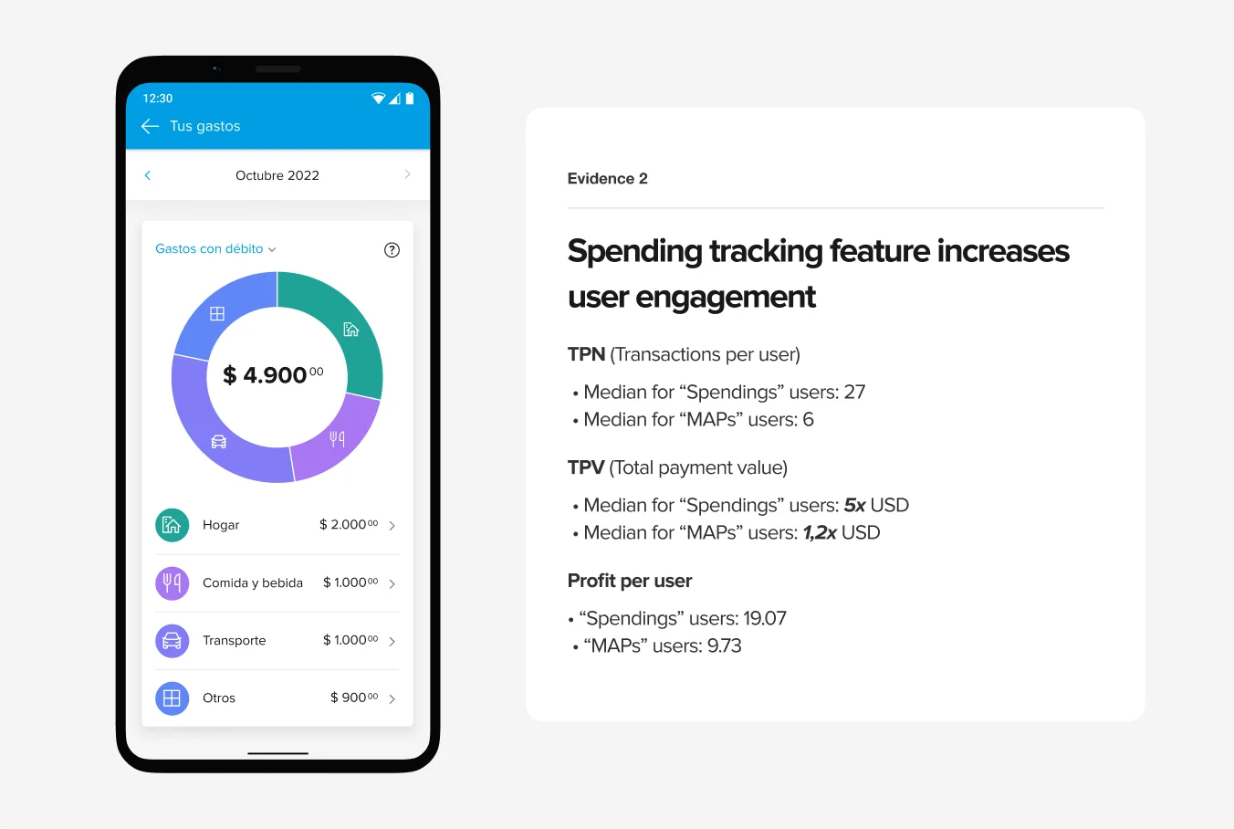
We didn’t have to argue whether it was worth building. The people already using spending tracking were a different kind of customer: a median of 27 transactions against 6, roughly twice the profit per user, three points higher on NPS, and between four and eight extra days of engagement depending on the segment.
So the question stopped being what to build and became where to put the door — and how much of the answer to show on it.
Solution
The hypothesis was written before the design: by showing people how they had spent with their debit card, they would use us more — measured in transactions per user and in click-through on the dashboard.
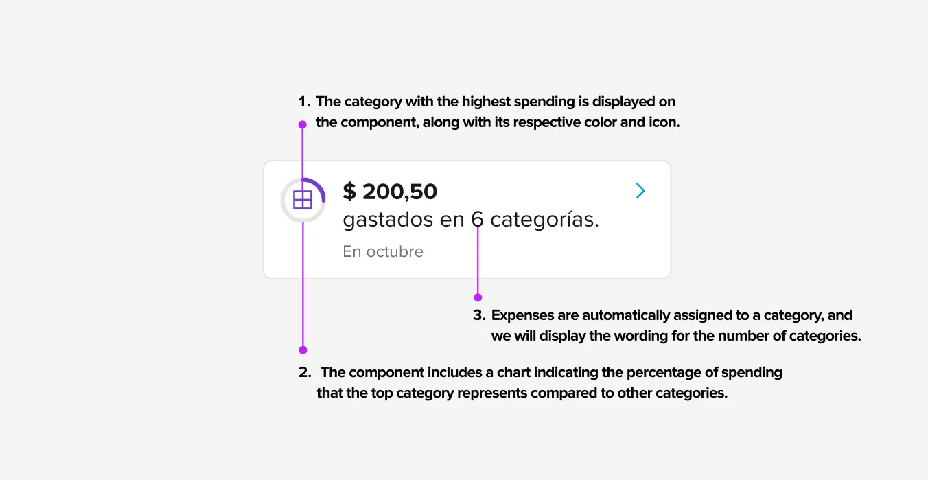
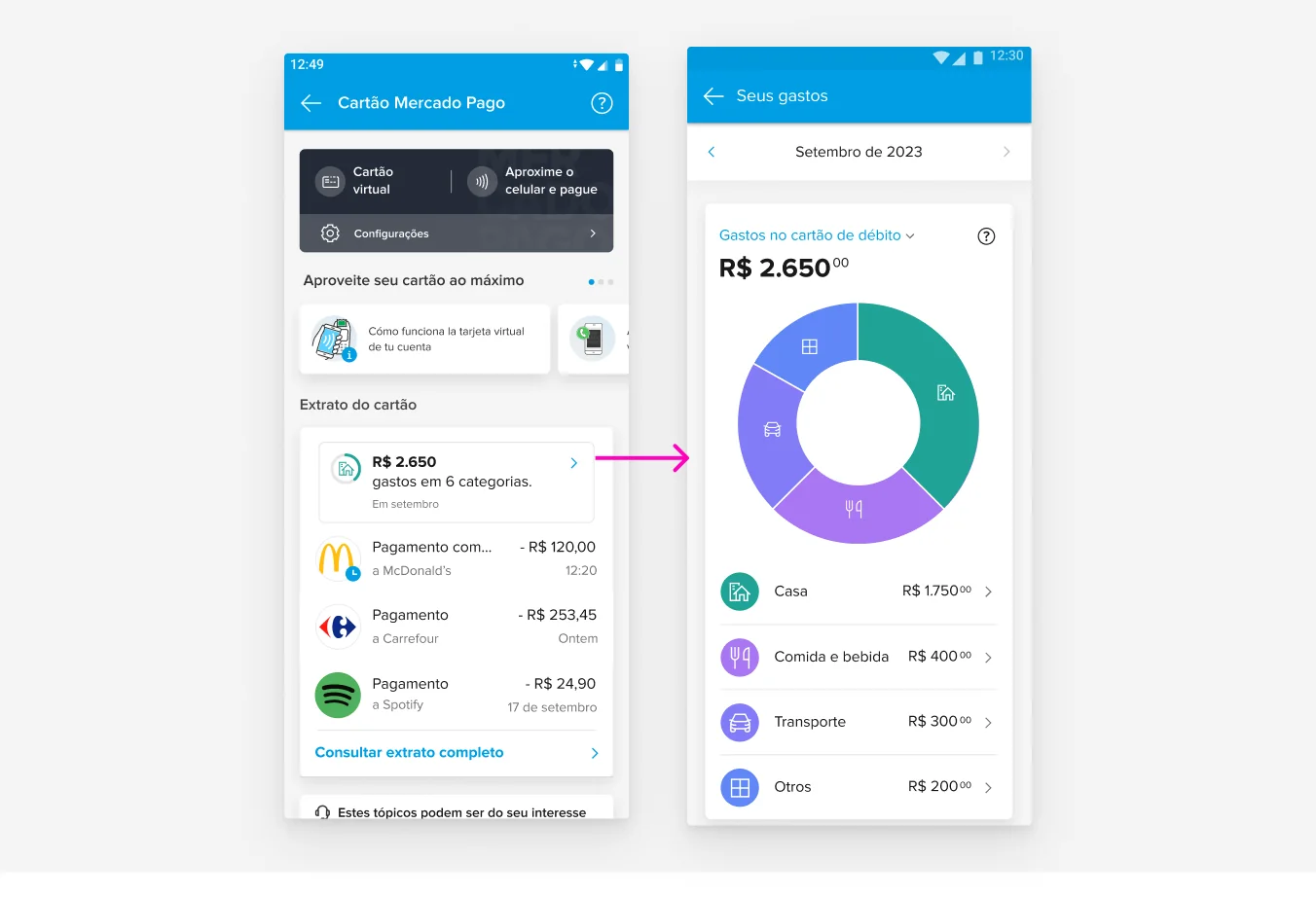
Scope was deliberately narrow. In: categories, total spent, current month. Out: credit card spending, and letting people build their own budgets. Four final versions were compared with their pros and trade-offs written out, and V4 won: it showed categories, generated visual engagement, scaled to any version of the dashboard, avoided confusion with credit, and — the decision that worked against the feature’s own interest — simplified the access button so the new component wouldn’t cannibalise the statement that was already working. Its declared trade-off: it wasn’t the simplest proposal to test engagement with.
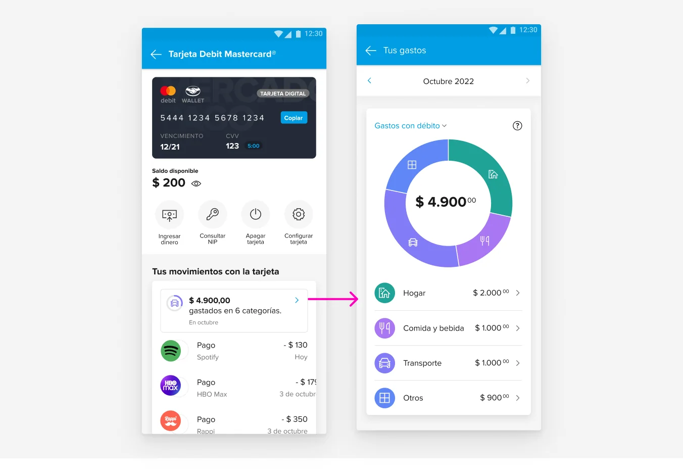
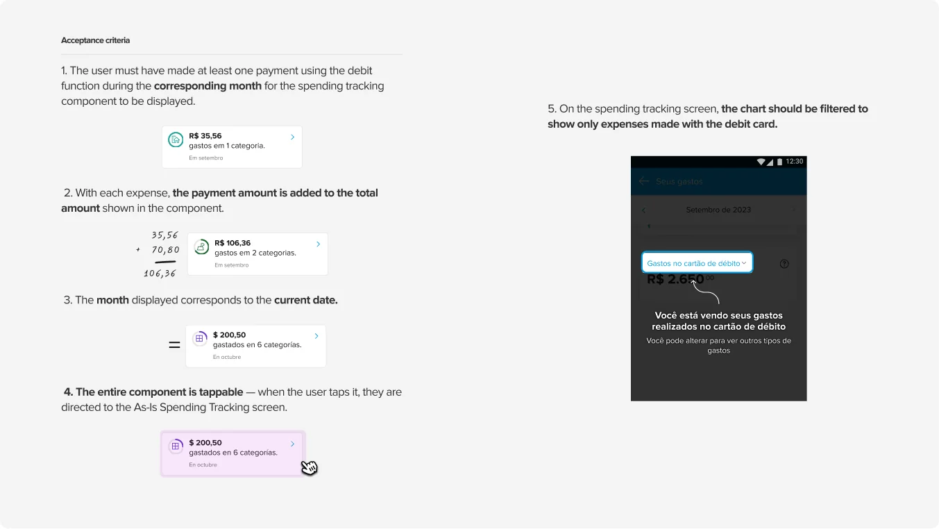
Impact
Click-through on the component went from 0% in August to 3% in December — the cleanest number in this case, because the door did not exist before it. Over the same stretch, contact rate fell from 7% to 4% in Mexico and from 9% to 6% in Brazil.
Third-month retention rose from 55% to 58% across 2023 and into 2024, but four initiatives were running at once and this was the last of them. The honest claim is contribution, not cause.
Why they work together
- Intelligent Issuance → arriving with the right expectation
- Spending tracking → finding the reason to come back
These aren’t two card projects that happened to share a year. They’re the two halves of the same window: one repairs what people believe before the card arrives, the other repairs what they can find when they open the app after it does. Same workshop, same cohort curve, same three months.