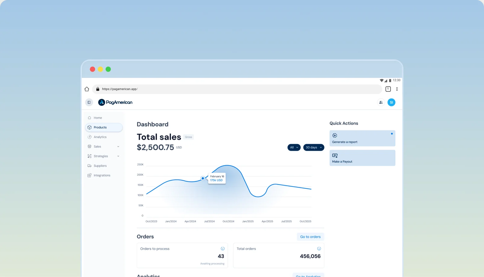
One designer. Three developers. Six months of runway. I built PADS as the thing that made every screen after it cost less to make: and then built a pipeline that turned a Figma frame into a registered component.
Context
PagAmerican is a B2B SaaS platform that takes legal responsibility for every transaction it processes. I joined as the fourth hire and the first designer. The brand fit in one folder: a logo and two PDFs with the brand colors.
By the time I left, the platform had 20+ modules, ~44 feature flows, 70+ screens and 260+ status variations. None of that was on a roadmap when I started. It was built by three developers and one designer, in parallel, against a fixed runway.
Problem
Every screen designed from scratch was a screen the team couldn’t afford.
With one designer and three developers shipping twenty modules in parallel, the bottleneck was how many times the same decision had to be made again.
Where the friction was
the same table cell, row, menu and state, rebuilt per flow. Density and context changed from one flow to the next while the underlying structure stayed the same.
What it cost the user
Inconsistent UI across a product where people are watching their own money.
What it cost the business
Development time spent re-litigating decisions already made, on a runway that had a floor.
How I knew
No formal research. The user base was small and highly expert, and a moderated test would have returned less than watching real usage. What I had instead was the platform itself.
I read the pattern. The first version of the product had been assembled by engineers using AI and an off-the-shelf component library, without a designer, which meant a de facto system already existed with no owner and no rules. The evidence was in the repetition: the same structures recurring across flows that had never been designed together.
Three moves
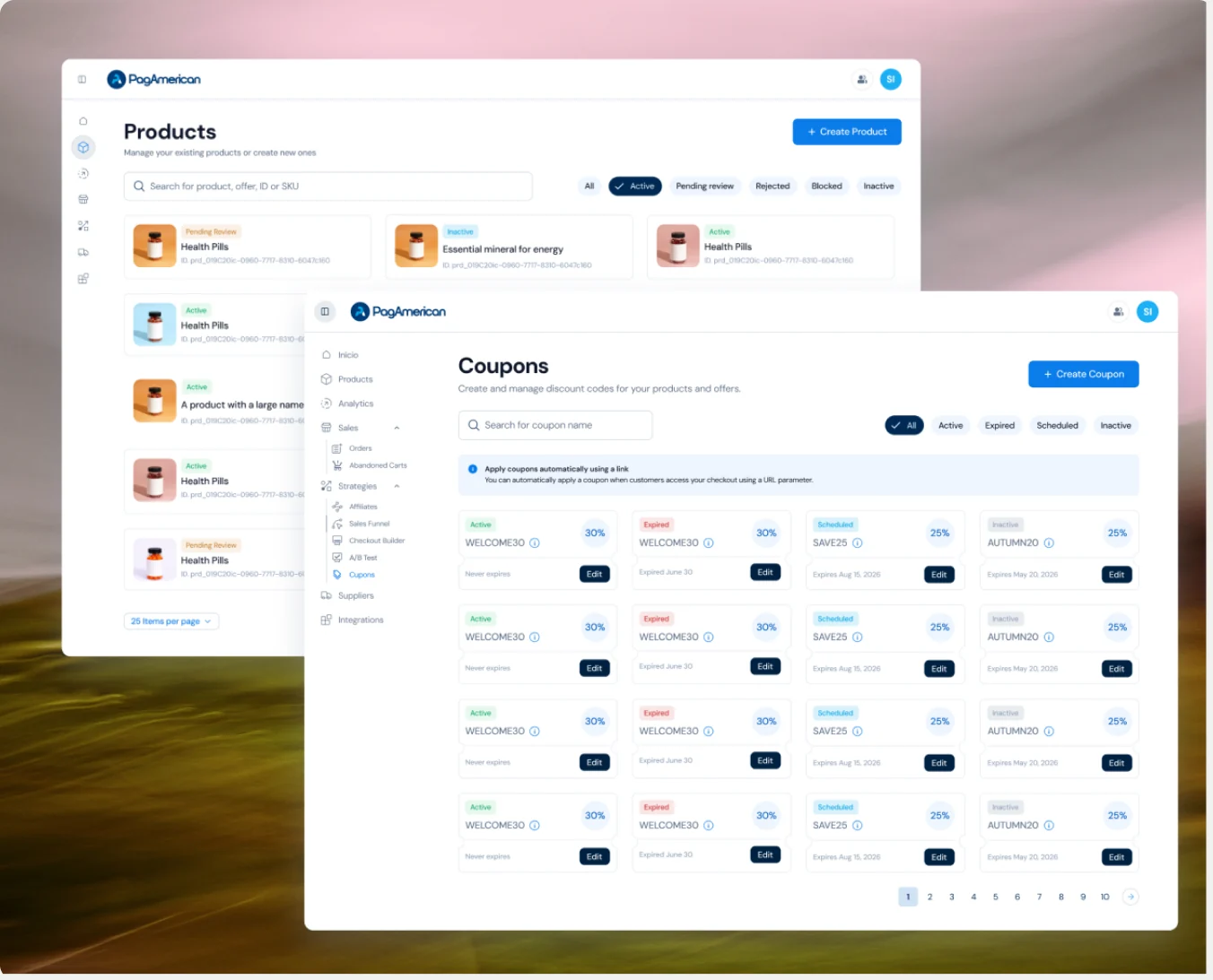
Find the patterns across flows and screens
What repeats between the products page, the orders table and the product detail is the system asking to exist.
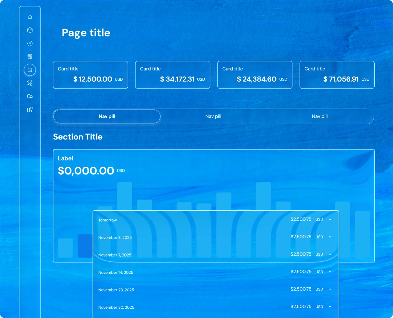
Design in blocks and rules
Pages built from rules: page title, metric cards, nav pills, section, table. A layout you can state in a sentence is a layout a developer can build without asking.
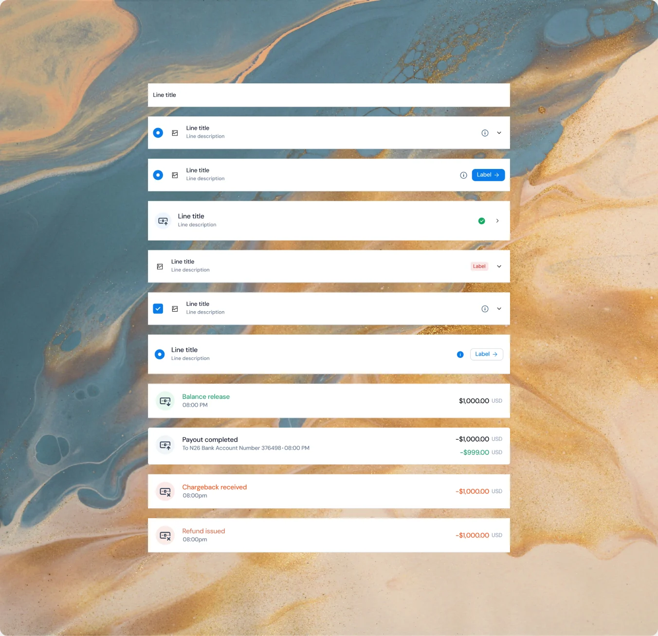
Modular experiences buy speed, consistency and scale
One row pattern absorbs balance release, payout, chargeback and refund without a new design for each. New states cost configuration instead of a project.
Success criteria of the project
Standardize components across the platform
One command, the same UI, with PagAmerican’s face, in any product.
Make development faster and easier
Fewer decisions, less code, less room for error.
Let the designer ship screens safely
Without writing code.
The architecture
-
Foundations
-
Components
-
Templates
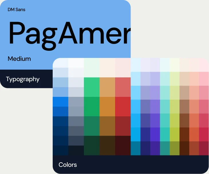
Foundations: DM Sans, brand blue, a semantic status palette, and light and dark from day one. Built on shadcn and Radix, so accessibility and keyboard behavior arrived resolved.
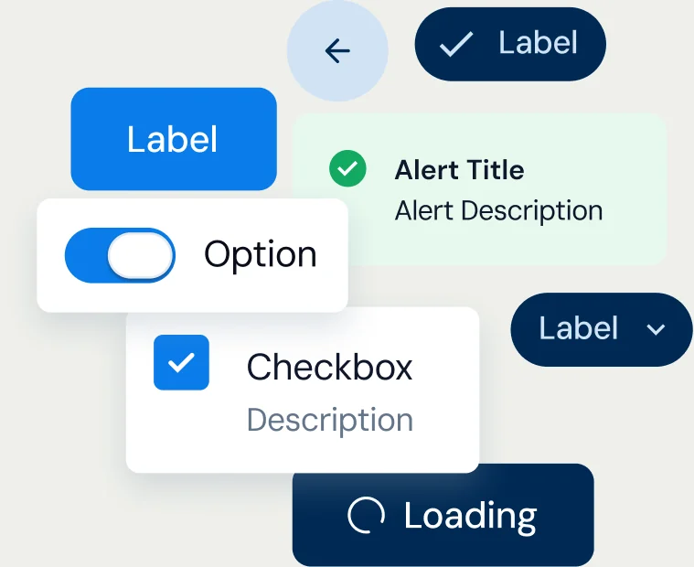
Components: primitive and composite. The composite layer is where the product’s own logic lives, the pieces that only make sense in a platform that moves money.
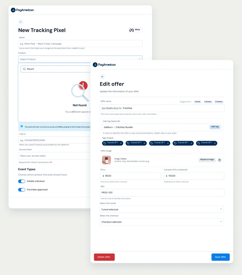
Templates: whole page shapes. This is the layer that let me hand over a screen as an arrangement of decisions already made.
The pipeline
Implementation through Claude Code
One frame in. One registered component out.
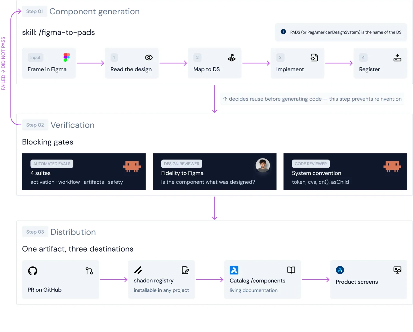
What it costs
Every component generated through Claude Code carries its own tokens, time and cost, pulled straight from the session transcripts. No manual logging.
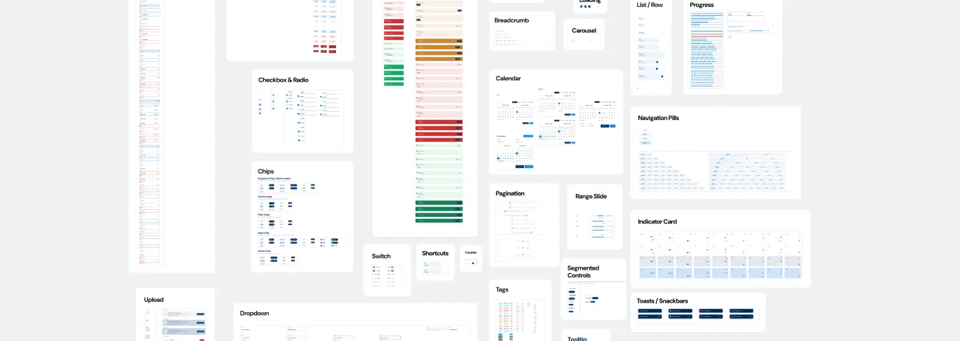
- Standardized components
- 32
- Tokens
- 240 Across 3 layers
- Items in the registry
- 34
- Pull requests
- 41 ~5 weeks
- Eval suites
- 4 Automated
- Hardcoded colors
- 0 automated contrast checking (accessibility) in CI
- Per component
- $ 6.23 USD
- Whole design system
- $ 200 USD
32 components
Where it shipped
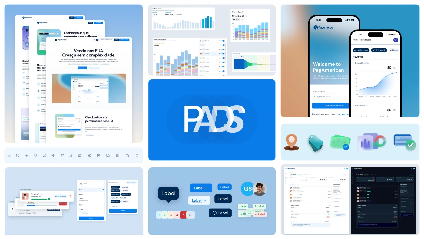
The same foundations carry a checkout a buyer sees once and a dashboard a user opens every morning
What I decided not to do
I didn’t wait for the system to be finished before shipping product. Components moved into a separate library as the pattern appeared, so the system grew at the same pace as the platform.
I didn’t build a primitive layer of my own. shadcn and Radix already resolved accessibility and keyboard behavior, and rebuilding that would have consumed runway.
Where it’s honest
Coverage was not total when I left. A partially adopted system still costs maintenance while only part of the platform gets the consistency.
41 PRs in about five weeks, four eval suites and zero hardcoded colors describe what the pipeline produced. Delivery velocity and rework were never measured before and after, so there is no claim to make there.
The counts answer different questions. 39 components exist in Figma, 47 with tokens and foundations. 32 went through the generation pipeline. 34 are in the registry.
What I learned
The system grows alongside the product. Componentizing into a separate library as the pattern appeared was the only version of this that fit inside a runway.
Declared scope beats hidden scope. “We haven’t built that yet” is information, and it’s the sentence that made the incomplete rollout something the team could plan around.
Autonomy is deciding and then answering for the decision. It was the most expensive part of working alone, and the most valuable.